


Apple’s first foldable iPhone, iPhone Duo, goes on sale on 23 October 2026, and the UAE is in the first wave of countries. For anyone running a website, the practical question is narrow: does your site need work before then? For most Dubai sites the answer is a qualified no, because Apple gave the two displays the same aspect ratio, so a site that already works on a phone will not break. The work that does matter sits in the middle, at the unfolded width, and in Split View, where your page gets half a large screen while the browser still reports a large screen. Neither of those is solved by the CSS foldable APIs, because Safari does not support them.
Key takeaways
- Both displays share an aspect ratio, so the folded state is ordinary phone territory and needs nothing new from you.
- The unfolded 7.6 inch width lands in the gap between most sites’ phone and desktop breakpoints, which is where layouts look stretched rather than broken.
- The CSS viewport segment media features are experimental and do not work in Safari, so they are not the answer on an iPhone.
- Container queries have been Baseline since February 2023 and handle Split View correctly, because they measure the container rather than the screen.
- Apple has not published CSS viewport widths for the Duo and nobody has tested a real device, so treat any exact pixel figure you read as a guess.
What Apple actually announced
Per Apple’s iPhone Duo announcement, the device has a 7.6 inch Super Retina XDR inner display, which Apple describes as 50 percent larger than iPhone 18 Pro Max, and a 5.4 inch Super Retina XDR outer display, both with ProMotion, Always On and 3000 nits peak outdoor brightness. Apple states that both displays share the same aspect ratio, so content scales proportionally between them. Apple describes the closed 5.4 inch panel as delivering 90 percent of the screen area of iPhone 18 Pro. It runs the A20 Pro chip, is rated IP68, uses a Grade 5 titanium frame and a hinge of more than 100 components, comes in star white and night sky, and starts at $1,999 in the United States.
The dates are what govern your planning. Pre-orders open on Friday 16 October and the device is available from Friday 23 October in more than 70 countries and regions, with 28 more on 30 October. Apple’s pre-order list includes the UAE, so Dubai customers will be holding one in late October rather than next year.
Two software details matter more than the hardware. Apple says iOS adapts as the device changes shape: content reacts as it folds, reorients when the device is turned to the side, and switches to the appropriate display when it is flipped over. And Split View lets users open two apps side by side on iPhone for the first time, including two windows of the same app such as Safari.
One device, three widths
That combination produces three distinct situations your page has to survive. Because the aspect ratio is shared, the folded screen is a smaller version of the unfolded one rather than a different shape, which is the detail that keeps this manageable.
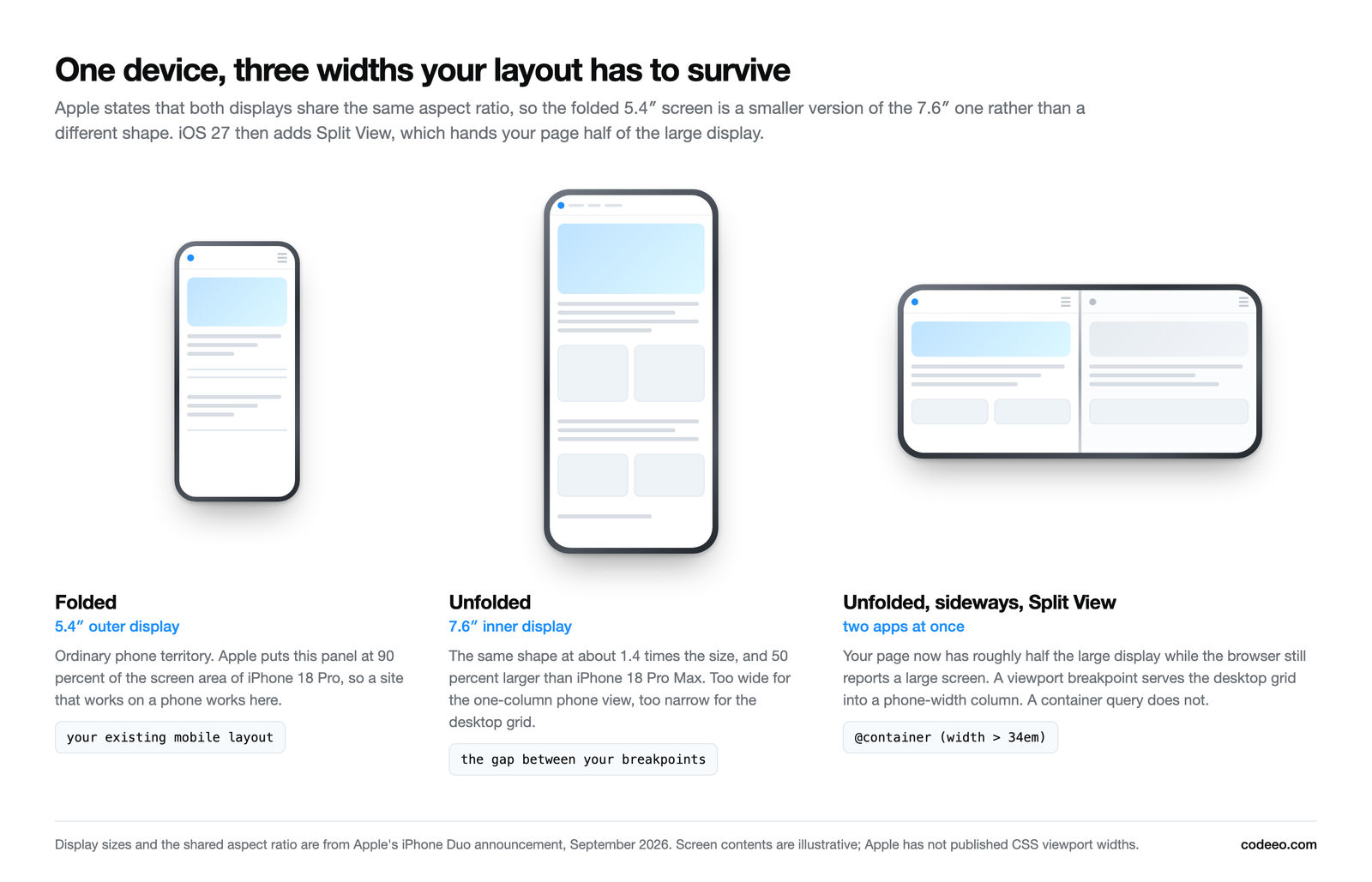
The folded state is the easy one. Because the outer display carries the same aspect ratio as the inner one and roughly the screen area of an iPhone 18 Pro, your existing mobile layout applies. If your site is sound on a phone today, it is sound folded.
The unfolded state is the one to think about. A 7.6 inch display in portrait is wider than any phone your CSS was written for and narrower than the desktop grid. Sites rarely break here. They look wrong: a single column of body text stretched to an uncomfortable line length, a two column grid with too much air in it, a hero image cropped to a letterbox, navigation that stays in a hamburger when there is clearly room for links.
Split View is the case that catches people out, and it is the reason the next section matters.
Why the CSS foldable APIs will not help you on an iPhone
There is a set of CSS features designed for exactly this problem. The horizontal-viewport-segments and vertical-viewport-segments media features report how many segments a hinge has split the viewport into, and env(viewport-segment-width 0 0) and its siblings give you the geometry of each one. On a dual screen device you can lay a list out on one panel and a detail view on the other.
They are also, for this device, the wrong tool. MDN records horizontal-viewport-segments as experimental with limited availability, explicitly noting that it does not work in some widely used browsers including Safari. Safari is the only browser engine on iPhone, so on an iPhone Duo these queries will not match, and any layout that depends on them falls back to whatever you wrote for everything else. The WebKit standards position issue for the Viewport Segments API has been open since March 2024 without a recorded position either way, so this is unresolved rather than rejected.
Expect a wave of articles in October telling you to adopt viewport segments for the new iPhone. Check the browser support table before you act on any of them. Writing CSS that cannot execute on the device it was written for is a peculiar way to spend a sprint.
What to use instead
The techniques that do work are ones you can apply today, on every device, without a single foldable in the office.
Container queries, because Split View lies to media queries
A media query asks how big the screen is. In Split View the screen is large while your page occupies half of it, so a viewport breakpoint will happily serve a three column desktop grid into a column the width of a phone. A container query asks how much room this component actually has, which is the question that was always the right one.
Container queries reached Baseline in February 2023 with Chrome 105, Safari 16 and Firefox 110, and became widely available in August 2025. There is no support argument left to have.
The pattern is two lines of setup and a query against the parent rather than the page:
| Instead of | Write |
|---|---|
@media (min-width: 900px) { .card { display: flex } } |
.grid { container-type: inline-size } then @container (width > 34em) { .card { display: flex } } |
Do this for the components that actually change shape: cards, media objects, product tiles, navigation, tables. Page level media queries are still fine for page level decisions.
Fluid type and spacing, so the middle width is never undesigned
Most sites have a phone size and a desktop size and interpolate nothing in between, which is precisely why the unfolded width looks unconsidered. clamp() removes the problem by design: font-size: clamp(1rem, 0.9rem + 0.4vw, 1.25rem) has a sensible value at every width including ones you never tested. The same applies to section padding and gaps.
A maximum line length that is not the viewport
The single most visible flaw at the unfolded width is body text running the full width of the page. Cap it. A max-width in the region of 65 to 75 characters on your prose containers fixes the unfolded state and improves every other width at the same time.
What breaks first, in our experience
When we test sites at awkward in-between widths, the same handful of faults come up.
- Body copy at full width, because the prose container has no maximum.
- Card grids that jump from one column to three with nothing sensible at two.
- Navigation stuck behind a hamburger well past the width where the links would fit.
- Hero images with a fixed aspect ratio that crops the subject out at unusual proportions.
- Tables that force horizontal scrolling because they were only ever styled for phone and desktop.
- Sticky headers sized in viewport height units, which eat the screen when the shape changes.
- Modals and cookie banners with a fixed pixel width that overhangs one side.
None of these need a foldable to find. Drag a desktop browser window slowly from 380 pixels to 1400 and watch. Everything in that list shows itself inside a minute, and fixing it improves your site on tablets and small laptops too, which are far more of your traffic than foldables will be for years.
The honest limits of any advice written today
The device is not in anyone’s hands yet. Apple has published display diagonals, not CSS viewport widths, and has not said what the device pixel ratio is, what Safari reports when the device is folded and unfolded, or whether a fold triggers a resize event or a reload. Anyone publishing exact breakpoint numbers for the Duo this month is inferring them.
That is a reason to prefer techniques that do not depend on knowing the number. Fluid values, container queries and sensible maximums are correct at any width, including the one that turns out to be real on 23 October. If your layout only works because you guessed the figure, you will be editing CSS in November.
Measurement is the same as ever. Google assesses Core Web Vitals at the 75th percentile with thresholds of 2.5 seconds for Largest Contentful Paint, 200 milliseconds for Interaction to Next Paint and 0.1 for Cumulative Layout Shift, and a layout that reflows awkwardly when a device changes shape is a layout shift risk. Our walkthrough on diagnosing INP covers the interaction half of that.
A checklist to run before 23 October
- Resize a desktop browser slowly from 380 to 1400 pixels on your five most valuable pages and write down every fault you see.
- Put a
max-widthon every prose container that does not have one. - Convert your card and tile components from viewport media queries to container queries.
- Replace fixed font sizes and section padding at your two breakpoints with
clamp(). - Check the navigation threshold: if the links fit, show the links.
- Test your booking, enquiry and checkout forms at an in-between width, because that is where a submit button most often ends up below the fold.
- Leave the viewport segment APIs alone until Safari ships them.
That is a day of work on most sites, and none of it is wasted if foldables stay a small share of traffic, because every item on the list improves the widths you already serve.
If you want this checked rather than guessed, the quickest version is a resize pass over your highest-value pages with the faults written down and costed. We build and maintain sites for UAE businesses through web design and web application development, and this is a half-day review rather than a project.
Device specifications and dates are from Apple’s iPhone Duo announcement of September 2026, and browser support from MDN, both read on 19 September 2026. The device is not released at the time of writing, Apple has not published CSS viewport widths for it, and nothing here is based on hands-on testing. Cover photo: Dubai Metro (8971328577) by Fabio Achilli from Milano, Italy, via Wikimedia Commons (CC BY 2.0).