 Web DevelopmentWordPress vs Drupal: Which CMS Is Right for Your Business?WordPress vs Drupal compared on ease of use, content modeling, security, performance, ecommerce and cost drivers, with five questions to help you choose.
Management Consulting Websites: What the Best Ones Do Well
What separates strong management consulting websites from forgettable ones: positioning, proof, pages, design choices and how to plan a custom build.
The best management consulting websites do three things quickly: they say exactly who the firm helps and with what, they prove it with real work and real people, and they make the next step obvious. Design matters, but it serves credibility. A buyer comparing three firms is looking for reasons to trust one of them, and the website either supplies those reasons or loses the shortlist.
This guide covers what separates strong consulting sites from forgettable ones, the pages and features worth building, design choices that help or hurt, and how to plan a custom build without wasting months.
Why a consulting website carries so much weight
Consulting is an expensive, invisible product. A prospect cannot try it before buying, so they look for proxies: the clarity of your thinking, the seniority of your people, the quality of past work and the way you present yourself. Your website is usually the first place they check those proxies, and often the place they return to before a pitch meeting.
That changes what the site is for. It is not a brochure. It is a sales asset that has to answer the questions a cautious buyer would ask a partner over coffee: what do you actually do, have you done it for companies like mine, who will I be working with, and what happens if I get in touch?
What the best management consulting websites have in common
A specific value proposition above the fold
Generic lines such as "strategy for a changing world" tell the reader nothing. Strong sites name the client type and the problem: operations consulting for mid-sized manufacturers, pricing strategy for software companies, or regulatory readiness for healthcare groups. A specific promise filters out poor-fit leads and makes good-fit visitors feel recognized.
Services described as outcomes and methods
Each service page should explain the problem it solves, how the engagement works, what the client receives and roughly how long it takes. Buyers want to picture the work. A short engagement model, such as diagnostic, design, implementation support, reduces the fear of an open-ended commitment.
Proof that can be checked
Case studies, named testimonials, published articles and team profiles with real experience all build trust. Anonymous quotes and vague "we helped a global firm" stories do the opposite. If confidentiality limits what you can share, describe the situation, the approach and the type of result without naming the client, and be honest about why.
People, not just a logo
Consulting is bought from people. Team pages with photos, backgrounds and areas of focus make a firm feel real. For smaller firms, the founder's profile is often the most visited page on the site after the homepage.
Thought leadership with a point of view
Insights pages work when they say something useful and specific. A short article explaining how you would approach a common problem demonstrates expertise better than a long list of credentials. Quality beats volume here; three sharp pieces outperform thirty generic ones.
One clear next step
Many consulting sites bury the contact route or offer five competing calls to action. Pick one primary action, such as booking an introductory call, and repeat it consistently. A secondary option, like downloading a guide or subscribing to insights, can capture visitors who are not ready to talk yet.
Pages a consulting website needs
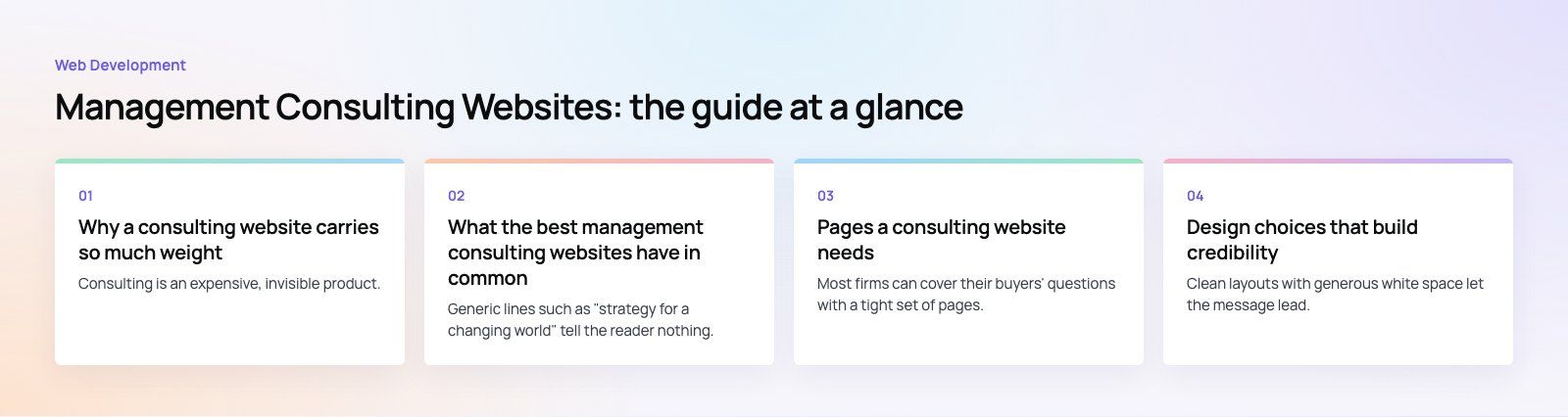
Most firms can cover their buyers' questions with a tight set of pages. The table below shows the core structure and what each page must achieve.
| Page | Job it does | Common mistake |
|---|---|---|
| Homepage | States who you help, with what, and the next step | Abstract slogans and stock imagery |
| Services | Explains problems solved, method and deliverables | Lists of buzzwords with no detail |
| Industries | Shows sector knowledge and relevant work | Claiming every industry |
| Case studies | Proves capability with situation, approach and outcome | Vague stories with no specifics |
| Team | Introduces the people a client will work with | Missing photos or outdated bios |
| Insights | Demonstrates thinking and supports search visibility | Thin posts written only for keywords |
| Contact | Makes it easy to start a conversation | Long forms and no response expectations |
Design choices that build credibility
Restraint over decoration
Clean layouts with generous white space let the message lead. Heavy animation, autoplay video and busy backgrounds can make a firm look more like an agency than an advisor. Use motion sparingly, where it explains something.
Typography and color that match the brand
Consulting brands often lean on a restrained palette and confident typography. Whatever you choose, apply it consistently across pages, documents and proposals so the firm feels coherent from the first click to the final report.
Real imagery
Photos of your actual team, offices and workshops outperform generic handshake stock photos. If you do not have them yet, simple illustrations or diagrams that explain your method are better than borrowed imagery.
Mobile first, not mobile afterwards
Senior buyers often check a firm on their phone between meetings. Navigation, case studies and the contact route must work comfortably on a small screen. Test with real devices, not just a browser resized on a desktop.
Accessibility
Readable contrast, keyboard navigation, alt text and clear headings help every visitor and widen your reach. The W3C Web Content Accessibility Guidelines are the standard reference, and following them signals the same care a client expects in your work.
Features worth considering
Interactive elements can help when they serve the buyer's decision rather than decorate the page.
- Diagnostic tools and calculators. A short self-assessment that scores a company's readiness on a topic gives value immediately and creates a natural reason to talk.
- Gated reports. A substantial research piece in exchange for an email works when the content is genuinely useful.
- Booking integration. Letting a prospect pick a slot for an introductory call removes back-and-forth emails.
- Personalized content. Showing industry-relevant case studies based on the page a visitor entered on can make the site feel more relevant.
- Chat. Useful for some firms, but only if someone answers well. A chatbot that cannot handle real questions damages trust.
Performance, SEO and security
A slow site makes a firm look careless. Aim to meet Google's Core Web Vitals thresholds for loading, interactivity and visual stability, which means compressed images, limited third-party scripts and good hosting. Our Core Web Vitals service covers this in more depth.
For search, build pages around the problems buyers search for, such as "supply chain consulting for retailers", rather than around internal service names. Each service and industry page should target one clear topic, with descriptive titles and headings. A technical SEO review catches crawl and indexing issues that hold strong content back.
Security is part of credibility. Use HTTPS everywhere, keep your CMS and plugins updated, protect forms against spam, and publish a clear privacy policy that explains how contact data is handled.
How to plan a custom consulting website
- Define your ideal client. Write down the industries, company sizes and job titles you want to attract, and the questions they ask before hiring a consultant.
- Agree the positioning. Settle the one-sentence description of what you do and for whom before any design work starts. Everything else depends on it.
- Collect proof. Gather case studies, testimonials, team bios and photos early. Content is the most common cause of delayed launches.
- Map the structure. Plan pages and navigation around buyer questions, using the table above as a starting point.
- Choose the platform. A CMS such as WordPress suits firms that publish insights often; a headless setup suits firms that want maximum speed and design control. Pick based on who will update the site and how often.
- Design and build. Start with wireframes for key pages, then visual design, then development and content entry.
- Test and launch. Check forms, mobile layouts, speed, accessibility and analytics before going live.
- Keep improving. Review which pages bring enquiries, add new case studies and insights, and refine the calls to action over time.
Mistakes we often see
- Writing for peers instead of buyers, with jargon that hides what the firm does.
- Launching with placeholder case studies and never replacing them.
- Letting the insights section go stale, which signals a quiet firm.
- Using a contact form with too many required fields.
- Ignoring analytics, so no one knows which pages generate enquiries.
A strong consulting website is clear about who it serves, honest in its proof and easy to act on. If you are planning a new site or rebuilding an old one, Codeeo's web development team and design team can help you shape the structure, content and build. A website audit is a practical place to start if you already have a site.
Frequently asked questions
A consulting website should include a homepage with a specific value proposition, detailed service pages, industry pages, case studies, team profiles, an insights section and a simple contact page.
Each page should answer a question a buyer asks before hiring a consultant, such as what you do, who you have helped and who they will work with.
Web DevelopmentWordPress vs Drupal: Which CMS Is Right for Your Business?WordPress vs Drupal compared on ease of use, content modeling, security, performance, ecommerce and cost drivers, with five questions to help you choose. Web DevelopmentCustom Website Development vs Website Builders: Pros and ConsAn honest comparison of custom website development and website builders: control, cost over time, SEO, integrations, and how to decide which fits your business.
 Web DevelopmentWeb Development Consultant: What They Do and When to Hire OneWhat a web development consultant does, how the role differs from a developer or agency, when hiring one pays off and how to choose the right one.
Tell us what the business needs. We will tell you what to build first.
Schedule a free consultation and get a written recommendation, with costs, before you commit to anything.
Get in touchPROVEN RESULTS
4.7 / 5verified reviews on Google