 Digital TransformationDigital Transformation Case Studies: 6 Verified ExamplesSix documented digital transformation case studies, from Netflix and Domino's to GOV.UK, Estonia and Dubai, with sourced results and lessons you can use.
CodeeoInsightsDigital Transformation
Arabic Logo Design for a Bilingual Brand Identity
Arabic logo design for a UAE brand means two wordmarks in one system: matched weight and visual size, the right lockups for signage and web, and a trademark filing plan that covers both scripts.
Good Arabic logo design for a UAE business means drawing two wordmarks that belong to one system, with matched weight, matched visual size and a shared attitude, rather than setting a transliteration of the English name in whichever Arabic font came with the software. The Arabic cannot copy the Latin letter for letter, because the script joins, has no capitals and sits on different vertical proportions. So the work is to agree what the two versions share, accept where they must differ, and plan the five or six lockups a Dubai company will actually use on its licence, signage, website and invoices.
Key takeaways
- Most Arabic letters take four joined shapes depending on their neighbours (W3C Arabic and Persian Layout Requirements, 2 October 2025), so spacing a word out like Latin capitals breaks it.
- Match the scripts by stroke thickness and perceived size, not point size.
- Plan five lockups before refining the mark: horizontal, stacked, Arabic only, English only and symbol.
- Abu Dhabi’s Commercial Signage Regulations (Version 5.0, 2022) list Latin lettering as the optional “second language” on a sign, which makes the Arabic line the one you cannot drop.
- Article 9 of the UAE trademark law, Federal Decree-Law No. 36 of 2021, limits a single application to marks that differ in minor matters such as colour, which affects how each script version is filed.
What Arabic logo design has to match, and what it cannot copy
Three properties of the script drive the design. First, joining. The W3C document sorts Arabic letters into dual-joining letters, which take all four forms, right-joining letters, which only take isolated and final forms, and non-joining letters. So an Arabic company name breaks into clusters at fixed points set by the letters, and closing or opening those gaps makes the word read wrongly.
Second, spacing. Latin wordmarks are often built by opening the letter spacing on capitals. Arabic has no capitals, and the W3C note records that when Arabic is stretched in headings or signs, the stretching is not equal between characters. It happens along the connecting strokes, through kashida, which the note defines as extending the horizontal connection between joined letters, or through the tatweel character U+0640, which has a fixed width. Used sparingly, kashida lets an Arabic wordmark match the length of its English partner; overused, it produces long flat bars that date the logo.
Third, height. The same W3C note says Arabic ascenders and descenders extend much further than Latin ones. Place the two words side by side at the same point size and the Arabic usually looks smaller in its body and taller overall. The visual centre, not the baseline, is what the eye compares.
What the two versions should share is everything above the letterforms: stroke thickness, contrast between thick and thin strokes, terminal shape (square, round or angled), internal white space and mood. A geometric, low-contrast Latin wordmark wants an equally geometric, low-contrast Arabic partner.
Picking a style that suits the Latin partner
Most Arabic logotypes for UAE businesses draw on one of two traditions. Kufi-derived styles are angular and built on a strong horizontal baseline, which makes them the natural partner for geometric Latin sans serifs. Naskh-derived styles are rounder, with more stroke contrast and the flowing forms used in book text, and they sit better beside humanist sans serifs and serif faces. The W3C note describes Naskh and Thuluth among the calligraphic styles and records that some typefaces join letters along an inclined line while others use a flat baseline; for a logo, the flat-baseline approach is easier to align with Latin.
The Latin partner usually decides this. A property developer with a thin, wide Latin wordmark and a law firm with a classical serif need different Arabic answers, and neither is “use Thuluth because it looks Arabic”. Ornamental calligraphy reads as heritage and hospitality; on a clinic, fintech or logistics brand it pulls away from the English version.
Interlaced calligraphy is also hard to read at the 16 or 32 pixel size of a browser tab icon, and harder on a sign read from a moving car on Sheikh Zayed Road. If the Arabic will appear small, keep each letter distinct.
Balancing weight and size between the two scripts
The fault we see most often is a heavy Latin word beside an Arabic word that looks a weight lighter, because both were set in “Bold” from unrelated fonts that define bold differently.
Measure instead of trusting weight names. Match the vertical stem of a Latin l or n to the stem of an Arabic alif, then scale the Arabic until its main letter bodies look equal to the Latin x-height at arm’s length. Expect the Arabic to end up at a larger point size. That is correct.
Then test at 20 millimetres wide for a business card and 5 metres wide on a screen. Pairings that balance at one size often fail at the other, usually because the dots that distinguish letters such as ba, ta and tha fill in when small.
The lockups a UAE business actually needs
A Dubai trading company needs its name in both scripts on its licence record, shop sign, invoice template and website header. Our article on UAE trade name rules explains why the commercial register holds both versions from day one. For the identity, that means a set of lockups with defined jobs.
| Lockup | Typical use | Common fault |
|---|---|---|
| Horizontal, Arabic right and English left | Website header, email signature, letterhead | Scripts aligned on the baseline instead of the visual centre, so one word appears to sink |
| Stacked, Arabic above English | Shop fascia, vehicle livery, square social avatars | Arabic squeezed to the English width, making it too small to read at distance |
| Arabic only | Arabic website, government-facing documents, Arabic social accounts | Never drawn, so someone improvises it later in a system font |
| English only | International proposals, overseas marketplaces | Treated as the master, with every other version derived from it |
| Symbol only | Favicon, app icon, embroidery | A symbol built from Latin initials, which means nothing to an Arabic reader |
The horizontal order follows reading direction. The W3C note states that Arabic script is written from right to left, so in a side-by-side lockup the Arabic sits on the right where an Arabic reader starts, and the English on the left. Reversing it for an English-first audience is defensible if it is a decision rather than an accident.
A monogram of two Latin initials is common and weak in the UAE, because half the audience reads it as abstract shapes. A symbol drawn from an idea, or one that reads as both an Arabic and a Latin letter, carries across both audiences.
Typefaces with a designed Arabic partner
If the wordmark starts from a typeface, choose a family whose Arabic and Latin were designed together. The Google Fonts catalogue listed 57 families with an Arabic subset when we checked its metadata on 28 September 2026. Several were built as matched pairs:
- IBM Plex Sans Arabic, in seven weights from 100 to 700, credited to Mike Abbink, Bold Monday, Khajag Apelian and Wael Morcos.
- Noto Kufi Arabic and Noto Naskh Arabic from Google, which cover the two style traditions described above; Noto Kufi Arabic runs from 100 to 900.
- Tajawal and Almarai, credited to Boutros Fonts and Mourad Boutros.
- Readex Pro, whose credits include Nadine Chahine, and Cairo, credited to Mohamed Gaber.
These are released under the SIL Open Font License 1.1. The licence text says its requirement for fonts to stay under the licence “does not apply to any document created using the Font Software”, which is what makes it usable for logo artwork. It also carries Reserved Font Names: IBM Plex, for example, reserves “Plex”. If you modify the font files themselves and distribute them, the modified version cannot use that name. Outlining and redrawing a wordmark is not the same as redistributing a font, but for a valuable logo, have the licence reviewed.
Most finished wordmarks are then adjusted by hand: a join shortened, a descender tucked in, a dot moved clear of the English below. That is where an identity stops looking like a template, and it is the stage of any logo design project where feedback from Arabic readers matters most.
Signage rules and the Arabic line
Signage rules are set emirate by emirate. Abu Dhabi publishes the Department of Municipalities and Transport’s Commercial Signage Regulations, Version 5.0 of 2022. Its content rules say a sign may include phone numbers or websites covering no more than 10% of the sign area, “a second language (in Latin letters)” and a business logo. Reading that the other way round, the Latin line and the logo are the permitted additions, and the Arabic is the base.
In Dubai, advertisement and signage permits run through Dubai Municipality’s online advertisement permit system, usually submitted by the sign contractor. When we tried to open its service overview on 28 September 2026 it returned an error, and we could not find Dubai’s proportion rules for Arabic and English text in an official document we could read. Contractors’ websites quote ratios for Arabic prominence that we could not verify against a Dubai government source, so we do not repeat them. Ask your contractor for the current requirement in writing before fabrication.
The design lesson holds either way. Build the stacked lockup so the Arabic can be the same size as the English, or larger, without redrawing anything. An identity that only works with a small Arabic line under a large English one is the version most likely to meet trouble at permit stage.
Registering a two-script logo as a trademark
The UAE trademark law is Federal Decree-Law No. 36 of 2021, issued on 20 September 2021. Article 2 defines a trademark widely, covering names, words, letters, symbols, drawings, colours and combinations of such elements. A bilingual lockup is therefore registrable as one combined mark, and so is each script on its own.
The question is how many applications you need. Article 9 allows one application for a set of marks that are identical in their main elements and differ only in minor matters, giving colour as the example, within the same category. Arabic-only and English-only wordmarks differ in the words themselves. Read plainly, that points to separate filings if each version is to be protected on its own; a trademark agent should confirm the plan for your classes.
Article 3 lists marks that cannot be registered, and item 3 is the one designers trip over in the UAE: public emblems, flags and other symbols related to the State, or any imitation of them. A falcon drawn to echo the national emblem, the flag’s colours arranged in the flag’s pattern, or anything else that imitates an official symbol is a poor foundation for a commercial mark. Registration, once granted, lasts ten years from the application date under Article 21, renewable.
Clear the words before paying for the drawing. A resolved Arabic wordmark for a name that conflicts with an existing registration is wasted work.
How the design work runs, and where it goes wrong
Brief the identity as bilingual from the first meeting. When Arabic is added after the English is approved, every decision was made in a script it does not suit. A better sequence:
- Settle the name in both scripts, including the Arabic spelling, with a native speaker who has not seen the English.
- Sketch both wordmarks in parallel, so the shared attributes are agreed before either is refined.
- Build all five lockups in rough before polishing any of them.
- Test at favicon size, business card size and sign size, in both colour and single colour.
- Have two or three Arabic readers who are not designers read it cold.
- Deliver outlined master artwork, with source fonts and licences recorded in the guidelines.
One issue we often see at step six is Arabic artwork that arrives with disconnected, back-to-front letters. That happens when text is typed into a design tool or a printer’s system without Arabic shaping switched on, so each character shows in its isolated form in the wrong order. Supplying outlined artwork prevents it in print; on the web, live Arabic text has to be marked up as right to left, which our guide to Arabic and English websites covers from the search side.
The other failure is a brand guideline that covers the Latin and ignores the Arabic. It should state the Arabic heading and body typefaces, the Arabic lockup’s minimum size and its clear space.
If you are building a new identity for the UAE, bring the name in both scripts to the first conversation, not the last. Our branding and website design pages set out how we can help with the identity and the site that carries it.
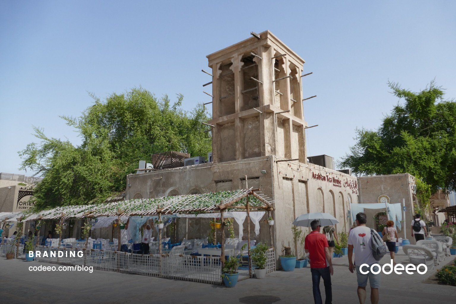
Legal and regulatory references are indicative and were checked on 28 September 2026 against the UAE legislation portal (Federal Decree-Law No. 36 of 2021 on Trademarks), the Abu Dhabi Department of Municipalities and Transport’s Commercial Signage Regulations Version 5.0 (2022), the W3C Arabic and Persian Layout Requirements (Group Draft Note, 2 October 2025) and the Google Fonts catalogue. Rules and permit criteria change; this is general information rather than legal advice. Cover photo: Al Fahidi Historical Neighbourhood (Bastakiya) by Ankur Panchbudhe, via Wikimedia Commons (CC BY 2.0).
Digital TransformationDigital Transformation Case Studies: 6 Verified ExamplesSix documented digital transformation case studies, from Netflix and Domino's to GOV.UK, Estonia and Dubai, with sourced results and lessons you can use. Digital TransformationBusiness Process Management Software: How to Implement It in 2026What business process management software does in 2026, the main tool types, real benefits and challenges, and a step by step plan to implement it.
 Digital TransformationDigital Transformation Technologies: What to Use in 2026The seven digital transformation technologies that matter in 2026, what each one fixes, where spending is going and how to sequence them so they pay back.
Tell us what the business needs. We will tell you what to build first.
Schedule a free consultation and get a written recommendation, with costs, before you commit to anything.
Get in touchPROVEN RESULTS
4.7 / 5verified reviews on Google